Website Design
Seasonal Changes
One thing I have implemented on our website is changing our logo in small but impactful ways to match the season. This adds interest and a fun seasonal aspect top the site without distracting from the actual content, which should always be front and center.
One thing I have implemented on our website is changing our logo in small but impactful ways to match the season. This adds interest and a fun seasonal aspect top the site without distracting from the actual content, which should always be front and center.

For the fall, our logo had a fall tree in place of the letter I, clearly referencing the season, but also keeping the words legible and free of distractions. This design lasted until around December, when the autumnal imagery was no longer relevant.

In December, we changed the logo to include an evergreen tree, some snow, and our logo inside a snow globe. This design clearly reflects the season, but keeps our brand recognition by not making major changes to the logo, color, or font. It also is able to last the entire winter season, because nothing is too explicitly related to any one holiday.
|
Photo of the Day
Another way to add interest to a site is by adding a visual element that consistently changes. I decided to implement this by implementing a "Spartan Shield Photo of the Day," which would feature one picture by a student photographer each day. This draws in viewers more frequently, as they know this will be updated on a daily basis- especially student athletes, who typically are unable to see their sports pictures until the yearbook is released. Other Changes I also collaborated with my advisor to make other, more minor changes to the site. We added a countdown to our homepage, which counts down the days until major school breaks and events, as well as simplifying the design of homepage subheadings. I appointed an Infographic Manager in my staff as well, and she became responsible for adding engaging and eye-catching graphics to articles each week. SNO sites also introduced my team to the infobox feature, which was helpful to adding interest. |

|
Social Media
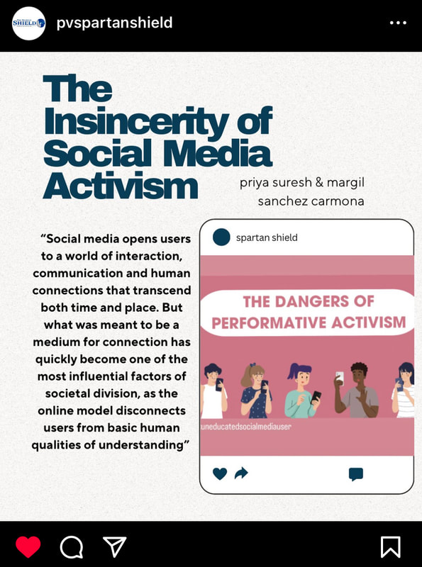
It's important that when pieces are teased on social media pages, they are represented in visually appealing ways that capture the attention of viewers. The Shield's social media posts usually include a picture or graphic, an interesting quote and the article's headline. The combination of these features is pleasing to the eye and encourages the causal viewer to take a look at the article.
|

|

|
Print Design
While a majority of my time is dedicated to the website, I also have done some design work for our print paper.
|
This background was designed for an article about new book ban laws in the state of Iowa in our first edition this year. I used Canva to create a background that had an obvious relevance to the topic, but wouldn't distract from the writing or look bad when changed to black and white.

|
For the same edition, I designed my own background for a piece about the law affecting what names students can be called in schools. Once again using Canva, I used a repeated a name tag motif, varying the color to add dimension in black and white.

|
Yearbook Design
Our yearbook's theme this year revolves around streaming and movies, which worked perfectly with the fall musical, "Beauty and the Beast." As I designed the page and added photos, it was important to me that a wide variety of cast members were featured, not just those who played lead roles. I also knew that filling an entire spread with photos from one production may be overwhelming to the eye, so I added a section on Iowa Thespian Festival with more variation. While not all the text is yet filled in on this page, I'm very happy with the visual aspect.

